


2025 Election Night Desk Plan: State-by-State Roles, Calls, Visuals
 2025 Election Night Desk Plan: State-by-State Roles, Calls, Visuals
Estimated reading time: 11 minutes
Thank you for reading this post, don't forget to subscribe!State-by-State Election Night Desk Plan: Roles, Calls, Visuals
Election night buzz starts the moment the first polls close, then it never lets up. A clear desk plan keeps the chaos in check, so producers, analysts, and reporters can move fast without guessing. You get clean handoffs, smarter calls, and on-screen visuals that tell the story in seconds.
This post breaks down state-by-state coverage at a glance, how roles fit together, how and when calls happen, and what visuals keep viewers locked in. We’ll track real-time updates from all 50 states, highlight what’s unique by state rules, and show you how a tight plan turns raw numbers into clear answers. For a quick primer on how calls work, watch:
Whether you run a newsroom desk or follow from home, you’ll see what makes results reliable and fast. Think decision desks, AP-style calls, and live maps that update without clutter. By the end, you’ll know who does what, when to expect calls, and how to set visuals that build trust.
Build Your Winning State-by-State Desk Plan
Lock in a plan that lets your team track every state with speed and confidence. Set up clear stations, choose the right tools, and map shifts to match poll closings. The goal is simple, fast calls with clean visuals and tight communication while the room buzzes with energy.
Set Up Key Tools and Team Stations for Each State
Give each producer or analyst a defined lane. State captains watch their assigned map, talk to local contacts, and feed clean notes to the decision desk. Group low-volume states by region to keep staffing tight, but keep battlegrounds solo.
Build a standard kit so every pod has the same muscle:
- Monitors: One for live feeds, one for precinct and county data, one for internal chat.
- Vote software: Your main results tool plus a backup ENR source, such as state or county dashboards. For context on how ENR systems work, see the EAC’s overview of Election Night Reporting systems.
- Data capture: Spreadsheets or a dashboard that logs county-level updates, turnout notes, and mail ballot estimates.
- Communication: Slack or Microsoft Teams for pods, a “hot” channel for calls, and a pinned checklist for each state.
- Visuals: A live map feed, a county swing board, and a ticker of key benchmarks.
- Reference library: Poll closing times, recount rules, and historical margins at your fingertips.
How to place stations so the room feels alive:
- Put swing state pods near the decision desk for faster back-and-forth.
- Seat regional pods together so they can share context and spot patterns.
- Mount two large “master” displays, one for national map status, one for poll closings.
Quick backup habits that save the night:
- Redundant inputs: Two data feeds per state, with a manual refresh path if APIs lag.
- Shadow logs: A second person confirms key entries for battlegrounds.
- Power and network: Battery backups, hotspot kits, and a “go dark” plan for essential stations.
- Escalation ladder: If data stalls, state captain pings the state channel, then the hot channel after 2 minutes.
Energy matters. Call out milestones on comms. Celebrate the first counties reporting. Small wins keep the room sharp deep into the count.
Coordinate Schedules to Cover Every State Without Gaps
Match your staffing to poll closings, then stretch to late counts. Build around the known cadence, from early Eastern closings to Pacific, then Alaska. Keep a live guide open for closing times, like POLITICO’s state-by-state list of when polls close.
A simple three-wave plan works well:
- Wave 1, Early Closings: Staff up from late afternoon to catch first projections and early county hits.
- Wave 2, Prime Window: Heaviest coverage when most states close and calls stack up.
- Wave 3, Late Counts: Focus on West Coast, Alaska, mail-heavy states, and tight races.
Rotation tips that keep eyes fresh:
- 90-on, 30-off during prime hours for battleground pods.
- Anchor + relief model: One anchor analyst stays all night for continuity. A rotating partner brings fresh focus.
- State captain handoffs: Use a short script with three bullets, such as current margin, outstanding vote type, and known bottlenecks.
- Swing state surge: Put your sharpest team on high-impact windows, then rotate them to a less intense state for recovery.
Plan for slowdowns without losing momentum:
- Flag states with heavy mail ballots or long count rules. Build patience into those slots.
- Create a “late shift lightboard” that lists what is still out by state, such as urban vs rural, mail vs in-person, or provisional buckets.
- Keep a steady cadence of on-air explainers that set expectations. Explain why a state is slow and what you are waiting on.
This schedule keeps the room crisp, reduces burnout, and improves quality control on tight calls. When every state has clear owners, time-bound shifts, and clean handoffs, your coverage feels smooth and exciting as each map flip lands in real time.
Unlock the Roles That Make Election Night Coverage Shine
Election night is a relay. Data races in, analysts test it, reporters ground it, and anchors thread it together. When each role clicks, calls feel precise, visuals make sense, and the audience trusts every update.
Spotlight the Decision Desk Heroes Who Call the Races
Decision desk analysts sit at the center of the action. They track county returns, compare margins to past cycles, and weigh vote share still outstanding. They study early vote, mail ballots, and day-of precincts, then ask one question: is the outcome beyond reach for the trailing side?
Their tools are simple but sharp:
- Exit polls and VoteCast give context on who voted and why.
- County benchmarks show if a party is overperforming or slipping.
- Outstanding vote math tests comeback paths before any call.
Caution wins tight races. Analysts hold back when late-count ballots can swing margins. The 2020 cycle showcased this patience, with careful calls in states where mail ballots landed late and shifted tallies. For a clear look at how late-count patterns affect results, see MIT’s brief on the “blue shift” in 2020.
The “we can call it” moment is pure electricity. It happens when the numbers close every door for a comeback. In 2020, the AP walked through the state map step by step, calling races only when the math locked in. Their recap of how they called the 2020 presidential race state by state shows how method and restraint create trust. For process nuts and producers building their own desk standards, study AP’s guide to how they call races. It lays out the checks that keep every projection clean.
Key habits that make calls stick:
- Set thresholds before election night, then honor them.
- Model uncertainty by vote type, not just by geography.
- Write the why for each call, so anchors can explain it in one breath.
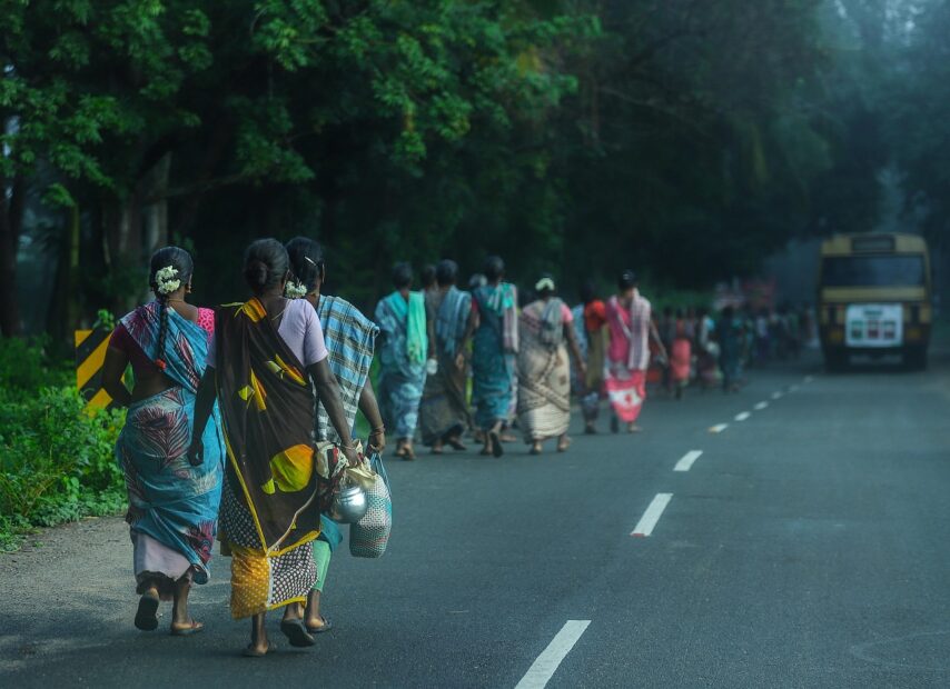
Field Reporters and Analysts: Your Eyes on the Ground

Photo by cottonbro studio
Local reporters and analysts bring the texture you cannot see in a spreadsheet. They confirm turnout lines, poll worker updates, and county bottlenecks. They check rumors with election offices and flag real issues, like scanner swaps or late mail batches.
Their feed keeps your desk honest and fast:
- Turnout reads from key precincts validate early models.
- Ballot mix updates explain swings as new tranches drop.
- County timelines warn when results will pause or surge.
Live hits add adrenaline without adding hype. Short, verified hits beat long speculation. Pair a 20-second field update with a lower-third that states the fact, the source, and the next expected data drop. When field intel and desk math agree, the audience feels the story lock into place. For a helpful overview of how responsible calls come together from unofficial returns, the Bipartisan Policy Center explains the process in plain terms: how media outlets call races.
Small team, local race? You can still mirror big-night discipline:
- Name one county contact per race and schedule quick check-ins.
- Use a shared log for turnout notes, ballot type, and reporting gaps.
- Clip tight live hits with one fact, one impact line, and one next step.
- Keep a rumor lane closed until you confirm with officials on record.
The result feels big-league. Data leads, field reports confirm, and your audience stays glued because every update builds toward the moment that counts.
Create Eye-Catching Visuals to Light Up Election Results
Strong visuals keep your audience calm, excited, and informed. When numbers hit fast, clean maps and charts do the heavy lifting. Aim for graphics that explain the state of play in under five seconds, then invite viewers to look closer. Families should follow along with zero guesswork, even as counties flip and new batches land.
Design Maps and Charts That Tell the Story at a Glance
Start with the core trio that every election night needs: red-blue state maps, vote percentage bars, and trend lines. Keep the design plain and punchy.
- State map basics:
- Colors: Use standard red for Republican, blue for Democrat. Mark independents or third parties in purple or gold. Keep toss-ups in light gray until called.
- Shading: Light shades for “leading,” full color for “projected” or “called.”
- Labels: Show clear state abbreviations on hover or as small tags. Avoid crowding small states. Use a callout box for DC and Rhode Island.
- Accessibility: Choose colorblind-friendly hues and add patterns for “leading” vs “called.” High contrast beats fancy gradients.
- Vote percentage bars:
- One bar per contest with each candidate color-coded.
- Display vote share, raw votes, and remaining vote estimate. Round to one decimal for clarity.
- Keep order by current rank, not ballot order. It reads faster.
- Example: 52.1% vs 47.4%, 1.2M vs 1.1M, 6% remaining.
- Trend lines:
- Use a time-series line or cumulative margin chart to show how the gap changes as batches drop.
- Mark key drops, like “mail update” or “large county release.”
- Cap y-axes so small moves do not look like swings.
Label everything like a scoreboard. A good lower-third or sidebar answers three things at once: who leads, by how much, and what is still out. Tight labels reduce chatter and boost trust.
Want a quick way to build these? Tools like Datawrapper make crisp bars and line charts without code. Try their free chart builder at Datawrapper charts. For map-first coverage, Flourish offers clear, interactive state and county maps that embed smoothly in sites and streams. See options at Flourish interactive maps.
Why it works: viewers lock in on color and position first, then numbers. Clean layouts keep adrenaline high without confusion. The room feels the excitement as states flip, but no one gets lost.
Add Interactive Twists for Deeper Viewer Engagement
Give people control and they stay longer. Clickable maps, zoomable county views, and tap-to-compare panels make the night feel personal.
- Clickable state or county maps:
- Tap a state to open county results, turnout share, and key benchmarks.
- Add small sparklines to show county movement since the last update.
- Include a “what is still out” line at the top for each state.
- Personalize the journey:
- Add a “Follow My State” pin so viewers can track updates.
- Let users toggle by vote type (early, mail, day-of) when data allows.
- Offer a simple filter for “tight races only” to surface drama fast.
- Free tools that punch above their weight:
- Build fast, responsive election graphics with Datawrapper charts. Great for bars, lines, and small multiples.
- Create interactive state and county maps with Flourish interactive maps. Their election templates are quick to style.
- For audience play and education, point to a sandbox like 270toWin’s interactive map. It shows how maps can invite exploration.
Design tips that keep clicks smooth:
- Keep hover states large enough for mobile thumbs. Use clear outlines on small counties.
- Use modest animation. Fade and slide are fine, but never block the data.
- Cache recent data and show a tiny Last updated timestamp, so users trust every refresh.
- Avoid walls of text in tooltips. Stick to candidate name, vote share, raw votes, and update tag.
Make it feel alive with tiny touches. A subtle glow when a state gets called. A short audio cue when your state updates. A ticker that highlights new county drops. The right interactive layer turns casual viewers into active fans, and it makes your coverage feel local even on a national map.
Conclusion
A strong state-by-state election night desk plan turns chaos into clarity. Clear roles, disciplined calls, and clean visuals move your team faster, keep errors low, and build trust with every update.
Use these ideas for your newsroom or your watch party. Assign a state captain, prep a call checklist, and set a live map with simple bars and trend lines. Share the why behind each call, and keep your audience in the loop as batches land.
Thanks for reading, and for caring about how results are reported. Stay informed, stay curious, and keep that excitement ready for the next election night. Democracy works best when we all show up.