


Streamline Sidebar Design for Clear Navigation and User Focus: 2025 UX Guide
 Streamline Sidebar Design for Clear Navigation and User Focus: 2025 UX Guide
Estimated reading time: 12 minutes
Thank you for reading this post, don't forget to subscribe!Streamlining Your Sidebar for Clear Navigation and Strong User Focus
Sidebars play a key role in guiding users through web and app interfaces. When designed right, they help visitors find what they need without pulling their attention away. But when sidebars get cluttered, they can overwhelm users and disrupt their focus, leading to frustration and slower navigation.
This post will show how simplifying your sidebar improves user focus and overall experience. You’ll learn to trim distractions, organize content clearly, and create a sidebar that supports users instead of competing for their attention. The result is smoother, clearer, and faster navigation that keeps users where you want them—engaged with your main content.
https://www.youtube.com/watch?v=5jvANIbtpzM
Understanding The Role of a Sidebar in User Navigation
Sidebars are more than just decorative elements on a webpage or app screen. They serve as quiet guides, gently steering users toward important features without shouting for attention. Think of a sidebar as a well-placed signpost on a winding trail—it points you to major destinations without cluttering your view of the landscape.
A sidebar sits alongside the main content, usually on the left or right edge of the screen. Its primary job is to offer quick, easy access to key pages or functions, helping users stay oriented and move through your site or app smoothly. When done right, it feels natural—almost like an extension of the user’s thought process.
How Sidebars Guide Users
A sidebar acts as a map that users refer to throughout their visit. It does three things well:
- Prioritize important links: The most frequently used or essential navigation items should be front and center, not buried in a crowd.
- Group related items: Logical clusters help users scan options quickly, reducing the mental effort needed to find what they want.
- Remain accessible: Sticky or fixed sidebars stay visible as users scroll, so they don’t lose their place or need to scroll back up.
When a sidebar meets these goals, it supports users without competing with the main content. It’s a helpful companion, not a distraction.
Common Pitfalls That Hurt User Focus
On the flip side, many sidebars get cluttered and overwhelm users. This happens when:
- Too many options compete for attention: A long list of links with no clear hierarchy feels like shouting different directions at once. Users often ignore the sidebar altogether when it’s overwhelming.
- Poor prioritization buries key links: When critical pages are lost among less important ones, users waste time hunting or give up.
- Inconsistent organization confuses users: Irregular groupings or random order forces users to scan more slowly and guess where things are.
- Sidebars are too wide or visually noisy: Oversized or heavily styled panels create visual clutter, pulling attention away from main content.
All these issues make the sidebar more of a barrier than a guide.
To create a sidebar that truly helps users, start by treating it as a navigation tool that deserves careful trimming and thoughtful structure. A streamlined sidebar shines by delivering clear paths and removing anything unnecessary.
For deeper insights on crafting an effective sidebar, this UX guide provides practical tips on width management and prioritization that preserve clarity without taking up too much screen space.
Understanding the sidebar’s role is the first step in transforming it from background noise into a smooth, intuitive navigation aid. The next step is learning what to keep, what to cut, and how to arrange your sidebar content for the best user focus.
Key Principles of Streamlined Sidebar Design
Creating a sidebar that users find helpful rather than distracting takes careful choices. A streamlined sidebar shapes the user experience by focusing attention on what matters and avoiding unnecessary noise. Let’s explore the core principles that turn a side panel into a trusted navigation companion.
Prioritize User Tasks with Clear Hierarchy
A sidebar should guide users by showing the most important options first. Group navigation items based on how often users need them and how critical they are to the task at hand. Think of it as a well-organized toolbox where the most used tools sit right on top, easy to grab.
Use visual hierarchy to make this work at a glance. Larger font sizes, bold text, or color highlights signal primary actions. Adding ample spacing around key items lets them breathe and stand out, while less important links sit lower or take a subtle style. This arrangement reduces clutter and directs eyes intuitively.
For example, main categories might appear in a dark color with bigger labels, while secondary options use smaller, lighter text. This contrast guides users to what they want most without confusion.
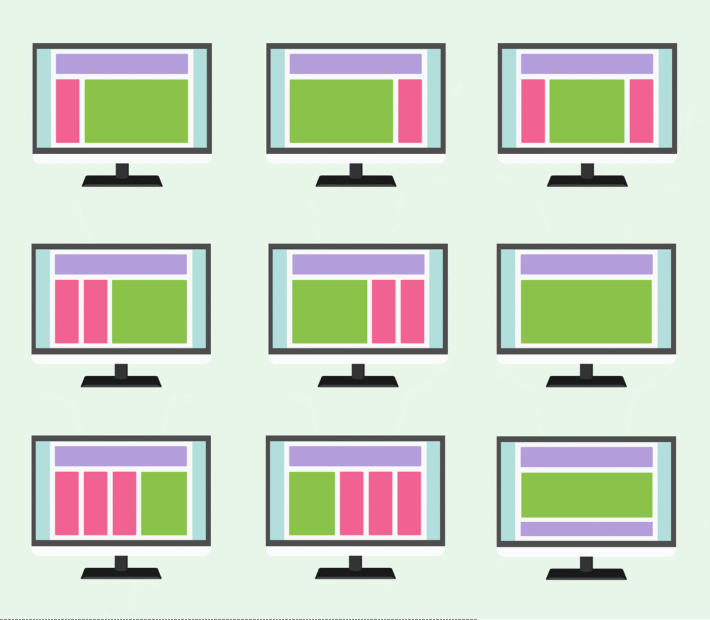
Limit Sidebar Width and Content
Keeping your sidebar’s width in check is essential. When expanded, a width between 240 and 300 pixels offers enough room for clear labels and icons without crowding the screen. When collapsed, it should shrink to 48 to 64 pixels, often showing only icons to save space.
A slimmer sidebar means less distraction and more focus on your main content. Using icons instead of full text where possible preserves clarity while reducing crowded text blocks. This helps users quickly recognize actions visually, especially if those icons are familiar or labeled with tooltips on hover.
Narrowing down the sidebar content to essentials keeps it snappy and useful. Cut out rarely used links or group them behind expandable menus to avoid overwhelming the user on first glance.
Use Expandable Menus and Clear Visual Cues
Expandable menus let you nest secondary options inside primary categories without showcasing all items at once. This approach keeps the sidebar neat and manageable, helping users zero in on relevant tasks.
Visual cues such as small arrows or chevrons clearly indicate which sections open or close. These subtle markers show the sidebar’s structure without extra words. When a menu expands, highlighting the parent item or using a background shade creates a clear path for the eye.
Microinteractions like smooth animations when expanding menus or hover changes on items add subtle feedback that makes navigation feel polished and responsive. These details improve clarity, letting users know exactly where they are and what’s available next.
Incorporate Responsive and Accessible Features
Your sidebar must adapt to different devices and users’ needs. On smaller screens, sidebars often collapse or slide out to avoid crowding space. Touch-friendly controls—such as larger tap targets and swipe gestures—make interacting easy on phones or tablets.
Keyboard navigation is also critical for accessibility. A well-designed sidebar allows users to jump between items using Tab and arrow keys. Incorporating ARIA roles and labels gives screen readers clear context, making the sidebar understandable for people relying on assistive technology.
By combining responsiveness and accessibility, your sidebar will serve a wider audience effectively. It ensures no one gets lost or blocked by layout flaws, keeping interaction smooth across platforms and abilities.
For more insights on optimal sidebar width and features, you can explore best UX practices for sidebar design that highlight how to balance clarity with functionality. Designing with these key principles in mind makes your sidebar a tool users rely on rather than avoid.
Enhancing User Focus Through Sidebar Functionality
A sidebar isn’t just a list of links or buttons. When designed thoughtfully, it can become a quiet but powerful tool that helps users stay focused on their main tasks. The trick is to make sidebars smart enough to show what matters most, adapt to each user’s needs, and deliver helpful information without stealing attention. Let’s break down key ways to shape your sidebar for sharper focus and smoother navigation.
Dynamic Content Based on Context
Imagine your sidebar as a smart assistant that anticipates what you need right now. Instead of showing a long menu of every possible option, it adjusts its content based on the current task or page. For example, when writing an article, the sidebar could highlight editing tools and reference links. When browsing products, it might switch to filtering options or order history.
This approach cuts down noise and minimizes irrelevant choices, so users don’t have to sift through clutter. Dynamic sidebars reduce cognitive load by serving just-in-time options, much like having a GPS that only shows turns you need next rather than the entire route map all at once. This makes interaction cleaner and keeps users anchored to their workflow.
Personalization and Customization Options
Giving users control over what appears in their sidebar is a simple way to boost focus. Allowing users to reorder sections, collapse groups, or hide items they don’t use tailors navigation to individual preferences. This customization turns the sidebar into a personal dashboard that fits how each person works.
Users often have unique priorities, so letting them pin favorite tools or links ensures the sidebar always keeps what is most important to them upfront. This flexibility cuts distractions by removing features that don’t add value to a specific user’s routine, making their time spent more efficient and less cluttered.
Integrating Notifications Without Overload
Notifications have a purpose but can quickly become a distraction if placed poorly. The sidebar offers a discreet spot for subtle updates, such as new messages or system alerts, positioned near the bottom or in a reserved corner.
By keeping notifications out of the main content area and avoiding flashy animations or loud colors, users get informed without feeling drawn away from their work. Think of it as having a gentle tap on the shoulder instead of a blaring alarm. This balance lets users stay on task while staying aware of important changes or deadlines.
Providing Quick Access to Frequent Actions
Speed matters when users perform repetitive tasks. Sidebars that include features like one-click account switching, pinned tools, or quick toggles in secondary panels help users jump between core actions without hunting through menus.
For example, a sidebar with a small panel dedicated to recently used files or favorite filters lets users work faster and with less frustration. These shortcuts act like a well-organized toolbox where the most-used items are always at hand, speeding workflows and reducing interruptions.
Incorporating these elements thoughtfully elevates the sidebar from a simple navigation aid to an active productivity partner, keeping users focused on what matters most.
For more ideas on making sidebars adapt intelligently to user needs while maintaining clarity, the Best UX Practices for Designing a Sidebar dives into how to balance functionality and clean design.
Testing and Iterating Sidebar Design for Optimal Focus
Creating a sidebar that truly supports the user’s focus means stepping back and watching how real people interact with it. Testing and iteration move the sidebar beyond design ideas and assumptions. They reveal what works and what distracts, so you can refine every element for clarity and ease. This ongoing process is about learning from actual user behavior and feedback — not guessing. It’s the difference between a sidebar that feels like a helpful signpost and one that feels like a confusing maze.
User Behavior and Eye-Tracking Insights
Watching a user is like peeking into their mind. Eye-tracking technology shows exactly where users’ gaze lands, how long they linger, and what they skip over. This data unveils how a sidebar truly performs, beyond what analytics can tell.
For instance, eye-tracking can reveal if important links are missed because they blend into the background, or if users bounce between too many options without deciding. It measures distraction caused by visual clutter and highlights the natural flow of attention from sidebar to main content.
These insights provide concrete proof of which sidebar areas attract focus and which create noise. You learn where users hesitate, what draws their eye instantly, and how their attention moves as they navigate.
This level of detail lets you see if your sidebar guides users like a gentle hand or overwhelms like a busy street sign. Tools for eye-tracking studies vary, but even basic setups can uncover surprising blockers to clear navigation. More advanced research on eye tracking in usability shows its strong role in improving user experience by shining light on what users actually notice (learn more about eye tracking in UX).

Photo by Md Jawadur Rahman
Feedback Loops and Continuous Improvement
No matter how detailed your initial design, the best sidebars evolve through constant feedback. Direct input from users reveals their true needs, preferences, and frustrations with your sidebar’s content and layout.
Set up regular feedback loops to gather this data. You might use surveys after tasks, interviews, or usability tests where users talk through their experience. Listen carefully for statements about distraction, missing features, or confusion. These are clues to what to simplify, rearrange, or remove.
Iterating means using this feedback to make changes, then testing again. Small adjustments like changing the order of links, adding clear headings, or reducing the number of options can have big effects on focus. It’s like tuning a musical instrument: subtle shifts create harmony and eliminate noise.
Repeat testing after each change confirms improvements or points out new issues. Over time, your sidebar becomes leaner and smarter, truly matching how users want to navigate.
By combining user behavior data with continuous feedback, your sidebar transforms from static design into a responsive tool that keeps evolving. This approach turns design work into a cycle of learning and refining, ensuring your sidebar stays effective and distraction-free.
For more details about setting up and running eye-tracking studies in UX research, this guide offers a thorough overview with practical steps to get started.
Testing and iterating might take time, but it’s the surest way to keep your sidebar focused on users’ needs rather than assumptions.
Conclusion
A sidebar pared down to essentials cuts through clutter and pulls user attention exactly where it should be—on the task at hand. Striking the right balance between clear structure, user control, and accessibility transforms a sidebar from background noise into a quiet guide.
When sidebars offer just what’s needed, adapt smoothly to context, and remain easy to scan, they reduce distractions and keep users firmly focused. This thoughtful design lifts the entire experience, making navigation feel natural and efficient.
Streamlining your sidebar creates a navigation tool that’s simple, flexible, and inclusive—a foundation that supports users every step of the way.